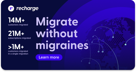
Recharge
Summary
In January 2021, Recharge rebranded to assert its leadership in subscription eCommerce. With a remote team and many new members, we started with deep competitor research and repositioned Recharge as a data-driven platform for optimizing subscription strategies and building robust customer relationships.
Role Designer, Art Direction
Deliverables Comprehensive brand identity across all touchpoints

Logo Development
As we delved into the logo design process, it became clear that simplicity was key. Recharge’s mission is to provide a smooth, effortless experience for its merchants, and a complex logo would be at odds with that goal. With this in mind, I started by sketching out concepts using basic shapes to convey a sense of connection, seamlessness, and clarity. This led to the creation of the ‘r’ icon, which paired beautifully with the logotype. The logotype was initially designed by me and later refined in collaboration with Jonathan Ball, resulting in a cohesive and effective brand identity for Recharge.

Product Imagery
One of our key goals in developing Recharge’s brand was to create a visual style that effectively represented the product’s capabilities through simplified and redesigned interfaces. This approach allowed us to highlight and showcase specific features with clarity and impact.


Illustration
Illustrations chosen for campaigns, internal retreats, and in-person events. For internal events, we customized color palettes to align with the specific locations and themes, enhancing the visual connection to each event’s unique atmosphere.


Hit Subscribe
Hit Subscribe is Recharge's podcast on subscription payments and customer retention. The brand development aimed to infuse it with a fun flair while maintaining a strong connection to Recharge’s core identity. Landing page designed by Emma Overholt.